By now, we all know what landing pages can do for a website’s conversion, how great they are at capturing leads and all marketers have already discussed how to create a landing page.
But honestly, a landing page, that standalone page that only needs to convert and nothing more, is the perfect page for you to have fun with your brand colors and brand tone while testing various things and capturing the attention of your audience.
But how are your prospects going to have as much fun as you have while you’re testing out ideas? And how are you going to convert them in the long run, especially when you need to run alongside some billions of brands doing the exact same thing? To answer these questions you first need to determine several key aspects of your brand.
What is your target audience like?
I know, I know, this is the first trick in the book, you already know that you need some serious buyer personas that will be working on par with what you’ll need to achieve.
For example, if your goal is to make sure that your ARR is high, you’ll need to study your target audience and make sure you understand why they’d keep coming back for more of your brand’s product or service, annually.
In order to do that, you’ll need to determine what your unique selling points are and craft your message in a way that will showcase value without being confusing or too cryptic - just enough.
So, ask yourself: What does your target audience want to see? Why would they be interested in your brand, or a competitor’s brand?
The answers to these questions will help you set your goals. And, in turn, your goals will help you create and deliver a landing page that will convert.
But is this enough? Well…

You may know your target audience, but for better engagement, you'd need to go for something more in-depth than a generalized persona.
How do you that? AI and machine learning are great tools for this, as they can process the data of your buyer personas and use it to create that extra, hyper-personalized touch of your landing page. Apps like Moosend are a great example of this, as their automation processes let you approach as many buyers as you want to while preserving close and human connection with each.
What should your landing page be like?
Creating a good landing page is not as difficult as it seems. Just remember that your content should be helpful for your customers and your structure simple and clear. Let's look at this in more detail:
Header-wise
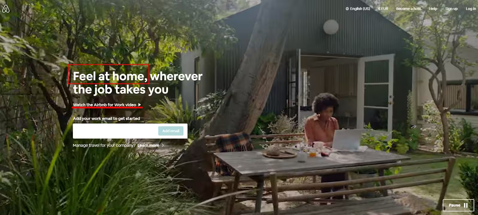
First things first, a header needs to be attention-grabbing, as much as the rest of your landing page should be. It also needs to convey a message and showcase value. Here’s a bit of what I mean:

Airbnb for business is a website that applies this principle on its landing pages, making the headline showcase value that is very different from what one would expect it to be. It doesn’t show its very affordable prices as a benefit. On the contrary, it focuses on how it makes users feel at home.
This is a very clever move, seeing as the header is one of the very first things a prospect will notice about the landing page and, therefore, the brand.
Also, let me just point out how this page uses the video trend to spice things up, and one of the CTAs has to do with this video alone.
The CTA is action-oriented and, in a way, “tells” the prospect what they need to do.
Of course, these things are not enough. And they’re not just header elements, but I couldn’t help myself.
Visual-wise
A page that is just a generic type of beautiful and useful, won’t convert. At least not as easy as it should, and it may end up being wasted funds off your marketing budget.
Therefore, you’ll need enticing visuals that will not only be pleasing but also engaging, something people will love to interact with.
Enticing language and a perfect headline are not close to enough though.
Your landing page should follow the fundamentals of a good web design to ensure its visually consistent and appealing.
The first thing to do would be to remain true to your brand’s tone since this is what builds trust between prospects and brands and can change your audience’s perception of what your brand is all about.
Take Coca-Cola’s logo and colors, for example. They’ve become such a pop-culture staple, that, when used by others, we all get confused and consider this a rip-off.
This is the logic you need before selecting a landing page template.
Now, the rest of the things you need would be a minimalistic approach and some great contrast game, when it comes to your colors. And there are two reasons behind that:
- A minimalistic landing page will load and convert faster, as it falls under the rule of “You have 7 seconds to make a first impression”.
- A minimalistic landing page will help your brand’s message shine brighter, seeing as the design will complement it rather than draw all of the attention on itself.
Add some interactivity
I hope it’s clear that conversion is the sole purpose of a landing page, therefore you’ll need to make everything you can, to help your page convert.
And while it’s common knowledge that you need to optimize for keywords, especially those long-tail ones, you’ll need to do something more than that to make your users spend time on your page and make it memorable.
Let me show you what I mean:

This landing page aims to gamify the user’s experience with a simple design and a click-and-play logic that is also simple but effective.
It was used as a means to gather user data that would help Lacoste find the perfect gift by answering questions and keeping the user on the page.
This kind of practice will help keep users on your page and increase dwell time, making search engines think that your landing page can offer something of interest and great value.
And you don’t need too much effort to gamify the experience either.
Just some clever visuals, perhaps a QR code with logo in your promotional email that will be landing users to your page - kind of like a treasure hunt - and you're good to go with a solid landing page that will create a memorable experience for your customers.
A/B testing and form length
Two tips that will help your landing page convert in more than two ways are A/B testing and the length of your form.
A/B testing is a surefire way to make your landing page - or anything, really - work and see what it is that can make a difference.
Change one element at a time, try experimenting with visuals and see what converts better. This will help you find that very pain point that will drive customers to you and help you achieve your goals.
This is not to mention that experimentation goes hand in hand with the element of surprise and can keep things interesting for longer than you’d think.
But onto the length of your form. Let’s assume that you’re offering a lead magnet. Make sure that your landing page is requiring just the right amount of information:

This landing page promises to give a free download that will help content marketers develop a content strategy.
It’s only logical, that this will be a long-form landing page, seeing as there will be more information needed than just a name and an email address.
But if what you’re giving out as a lead magnet is a free quote, make sure to keep your form simple and to the point.
In other words: You need the perfect analogy between the length of your form and the lead magnet. An expensive case study that you’re giving out for free, a demo, an ebook, or a playbook is the perfect lead magnets for longer forms. A free quote, however, is not something that warrants all that information.
Product page
You've probably seen numerous product pages before creating your own one. But questions would never leave you. To be exact, questions about the features you want to add to make your product page ideal, but not to overdo and oversaturate the page so the visitor doesn't get lost in the ocean of widgets and mess.
Therefore, you start iterating over apps and services to add to your product pages. A lot of widgets come to your mind. But be sure to use the least number of them and only the essential ones. Here is the table for your convenience:
- Photo reviews app
- Wishlist
- Size chart. We recommend the Kiwi Sizing app
- Product recommendation or Frequently bought together
We recommend PickyStory, a top Bundles & Deals app on Shopify. PickyStory helps you generate more revenue from every store visit by adding high-converting deals to any page of your store. Inventory is synced at the SKU level, there are many deal and discount types to choose from, and you will see the results immediately.
Once you finish crafting your ideal product page, make sure to run a page speed test and ask a few friends to use it and judge it.
Recommended App
We recommend PageFly to all our customers when it comes to creating high-converting landing pages on Shopify. The flexibility of the app provides customizations and various 3-rd party app integrations.
PageFly is a long-standing Growave partner and currently, we have integrations in product reviews and wishlist, apps can be enabled in a few clicks without coding.
Takeaway
Landing pages may seem like a real feat, but it’s not rocket science.
If you follow the aforementioned pieces of advice, you’ll see a serious increase in your conversion and you’ll turn landing page creation into child’s play.
So, what do you think? Is there another technique you’ve used that has helped your landing page’s conversion or are you just starting out?
Do tell us in the comments and, as always, share the knowledge with your favorite marketer!
Want to close the gap?
Trusted by over 15000 brands running on Shopify


